
Case study
Jacky Nayak Studio: A Minimal Portfolio Site for a Fashion Photographer
A portfolio website for Jacky Nayak Studio designed to stay out of the way of the photography: a single-image homepage, a dense editorial gallery, and one-click routes to contact and Instagram.
- Client
- Jacky Nayak Studio
- Live site
- jackynayak.com
- Service
- Website Development services
The starting point
Jacky Nayak is a fashion and editorial photographer. For a photographer’s site the work is the brand: the design has to frame the images, not compete with them, and make it obvious how to get in touch.
This case study describes the site as it appears live at jackynayak.com, reviewed on 21 October 2026. All photography shown belongs to Jacky Nayak Studio.
Screenshots
Captured from the live site (visit it).
What we delivered
Each item lists where it can be verified.
Visual identity on screen
A restrained frame so the photographs carry the brand.
Wordmark-led header
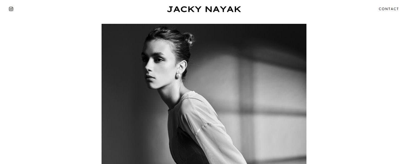
The studio’s name sits centred as a wide-tracked wordmark, with Instagram on the left and Contact on the right — the same three elements on every page.
Evidence:
Live site: all pagesOne typeface, white canvas
A single geometric sans-serif (Europa) for navigation and text, set small and spaced out against plain white, so colour comes only from the photographs.
Evidence:
Live site: computed styles
Portfolio presentation
Letting a large body of work be browsed quickly.
Single-image homepage
The homepage shows one black-and-white portrait and a single “Overview” button, so the first impression is one strong image rather than a crowded grid.
Evidence:
Live site: /Editorial gallery
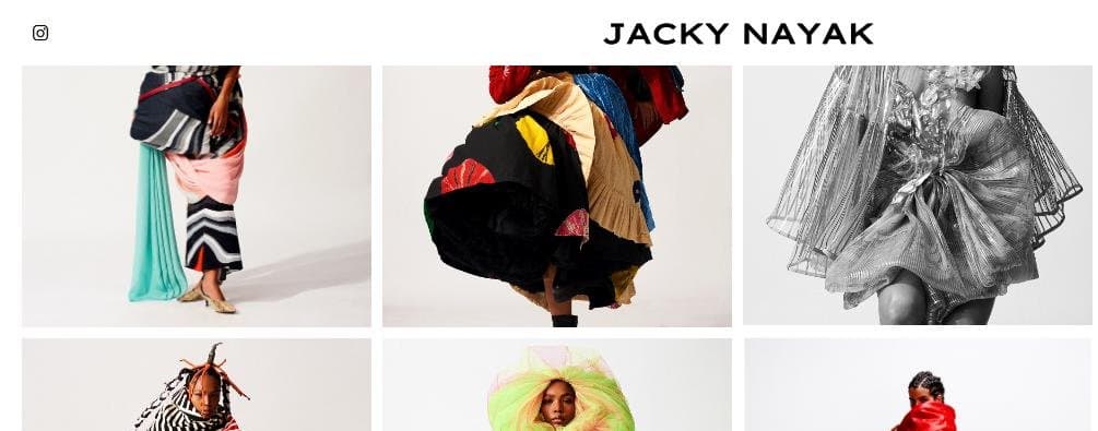
The Overview page presents around 74 images in a tight four-column grid on desktop, mixing colour and monochrome work, with images loading in as the visitor scrolls.
Evidence:
Live site: /overview
Contact & responsiveness
Making the next step obvious on any screen.
Contact from every page
Contact is in the header of every page and leads to a page with the studio’s email address and phone number; the Instagram link points to the photographer’s profile.
Evidence:
Live site: /contactResponsive layout
The theme adapts the layout at tablet (1024px) and phone (767px) widths, with a device-width viewport.
Evidence:
Live site: stylesheet breakpoints
What the evidence supports
- The site presents the studio’s portfolio in two clicks or fewer from any page, with contact one click away.
- The design uses one typeface and a white canvas throughout, so the photographs provide all the colour.
What we don’t claim
- The photography: every image belongs to Jacky Nayak Studio.
- Enquiry, booking or traffic figures: we haven’t published any.
Stack & tools
- WordPress
- WPBakery Page Builder
- Responsive theme
Want the same audit for your site?
See the full service, or tell us what you’re working with.